Monday, November 5, 2007

another shading exercise


above: a sphere, cone and cube assignment from our textbook.


above: the weird shape that was difficult to figure out how to shade. not too sure about this one.


above: a still life of a ball, box and dinosaur bank.

Tuesday, October 30, 2007

Design Research: 10 buildings (work in progress)


above: information kiosk for visitors to New York’s garment district.


above: Los Angeles International Airport's Theme building


above: Rotterdam ____?


above: Kon Tiki Hotel, Phoenix


above: Futuro House

Monday, October 29, 2007

goofing off

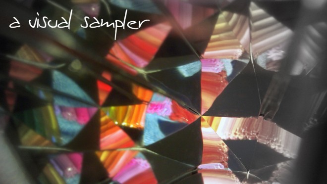
I found the "kaleidoscope" I was trying to incorporate into our memory project today. I wanted to know what would happen if I held the camera up to the mirrors and used a row of markers as the reflected object. These are the results:


I know it isn't a drawing or a studio project, but I had fun with it and thought I would share.

Wednesday, October 24, 2007

Design Research: 10 websites reviewed

  1. Karim Rashid's website is awesome. His designs are incredibly colorful and the site does a fantastic job of capturing his personality. The site opens to a playful picture of him; beneath that are easy to see interactive icons to direct you around the site. What I particularly like is that the home page (and most of the site) takes up about only 2/3 of the page vertically; it is visually uncluttered and very easy to navigate. Once you select an icon, the next page brings up small and intriguing thumbnails of Karim's products. Each thumbnail can be clicked to access a line of products or more photos. Because you can't see all of what's in these tiny pics, curiosity gets the best of you and you'll being clicking away. I do love this designer's work, and am very pleased that this site is befitting such a cool guy.
  2. Studio Tord Boontje is a beautifully designed website for Dutch designer Tord Boontje. His products and installations involve magnificent laser-cut designs on materials such as steel, Corian, and glass. These delicately patterned pieces are reflected in the design of his website. What I find most attractive about the site is an ethereal image of cut paper flowers that remains in the upper left corner throughout your navigation. The flowers move as though caught in a breeze, and the image is semi-transparent, like it is behind vellum. The entire site is pleasing to the eye, and very easy to use. The categories to choose from are simple and few, and there are not a million things branching off of each category to cause confusion. Simplicity works in favor of this site for sure.
  3. Can you say "bor-ing"? You will if you visit the Design Group of Lynchburg, Inc.'s website. I can barely stifle the yawns even as I type this after viewing their site. The company offers graphic design services (including web design!) and I'm wondering if they are serious about this claim. The site has a red background with a cheesy swirly type thing at the bottom of the page, and that's about as far as their creativity goes. The top of the page has a plain white box with four categories: home, services, works, and contact us. EXCITING!!! And what's worse is that these titles are in a handwritten font with the same thing written under it in a traditional Times type font. Why? I don't get it. Having four items in the index is simple, which I like, but when you click on any of these you don't get any further than one more page. For example, click on "services". All you get is a very slight change in a white text paragraph that lists what they do: billboards, brochures, logos, web design, etc. That's it. Nothing else about the red background page changes. Click on "works" and a few thumbnail images appear, but all that leads to is a pop-up window of poorly chosen photographs of their completed projects. In a nutshell, I would not hire this firm to make invitations for my kids' parties much less something substantial like a billboard or publication if it's going to put me to sleep like their website. (I have never been this mean in my life!!)
  4. I stumbled across the Melia Design Group when I did a Google search under "design group". I had to check it out since my classmate Melia sits next to me and I thought she would like to hear about it. I was pleasantly surprised at what the group does and also at how well their website is designed. It appears that they have spent a lot of time creating an appealing and impressive professional site. Offering services such as web design and print & advertising, this company has quite a few famous clients including National Geographic, Biltmore Estate, The Smithsonian Institution and PINK Magazine. There is no doubt they have acquired these clients due to their amazing work as seen in their portfolio. The site itself conveys their style in clean lines, trendy colors, and an honest approach to marketing. A sense that MDG genuinely cares about what they do and also about their clients is evident in the text of the main design page: "Does good design matter? The real question is 'Does good design matter to your customers?'" They have successfully put together a site that shows off this ideology. While there is a lot of information to gather from the site, it is arranged in a way that is well organized and not overwhelming. I also like that there are moving features, like photographs that reveal themselves in a three-part sequence as you navigate through their portfolio. Stagnant is boring, and you won't find that here. The only thing I dislike is that you have to scroll down just a bit to click on the clients' names when viewing the portfolio page; this is a minor issue but it could have easily been avoided to be a little more user friendly. A convenient feature is direct links to their client's sites so you can see their designs at work.
  5. Hooray for "MoCo Loco"! The Modern & Contemporary Design Blog (it's formal title) is a treasure trove of what's happening in the design world now. What a great place to stay abreast of what shows/installations are upcoming as well as seeing new (and ultra-cool) products that you may love but had no idea existed. I'd like to keep this site bookmarked for a couple of reasons: 1--to drool over the products & art shown; 2--as future project inspiration. Since the site is formatted as a blog, it is quite easy to look through and is well organized through a search feature as well as archives (although I'd rather just stumble around and gawk at all the cool stuff!). Be sure to check it out!
  6. A2 is an industrial design group that makes products we've all seen and probably never gave much thought into how it was made. When I came across their site, I was intrigued by these little cupcake holders (they have feet!) that I've seen at the craft store. Upon further investigation, I discovered that A2 is the design behind many familiar products such as Wilton bake ware, Cuisinart kitchenware, and Ekco housewares. (Ok, they're familiar to me because I've worked in retail before.) The site is a simple grid/block pattern that you simply click exactly where you want to go. It's well organized and has a simple color scheme of grays on white. The companies that A2 creates designs for are listed on the left and also have links to their own respective websites. If you're at all interested in industrial/product design, definitely have a look. It's pretty neat to see that everyday objects have a lot of thought and process behind their design.
  7. Studio Daniel Libeskind's site has a great concept for navigation that reflects the work of the architect and his studio quite well. The color scheme is black and grayscale, a simplicity I enjoy, and the categories resemble file folders in a sense that you have headers above horizontal lines simulating the pulling up of a folder. In contrast to the grayscale, bold and energetic red text is dotted throughout the articles in the folders you've clicked. Libeskind's work is beautiful, clean and contemporary, and his site is befitting this image. (My favorite part is the white-on-black sketching on the home page. Very powerful.)
  8. Why didn't I find these guys first? I think I'm in love... with Pentagram Design. THEY DO EVERYTHING! And even better, they do it well. Out of all of the sites I've reviewed, I spent the most time here and loved every second of it. There are still many things I haven't explored, but I certainly intend to as they are my new fave. Pentagram's work includes: architecture, books, editorial, exhibitions, identities (branding), interactive (media) design, marks (logos), packaging, print, products, and signage. The site is crisp, clean and visually uncluttered. You could spend hours viewing their portfolio, which is chock full of photos. There isn't anything about this site that I don't like, except that my name isn't on it's current roster of employees. (Let me commence drooling...)
  9. A great minimalist yet colorful site I've discovered is for Paris based design group ora-ito. Ora-ito is a product and packaging design company and is behind many famous brands and products we are all familiar with, such as Adidas, Virgin, Heineken, Gucci, Levi's, LG, Luis Vuitton, and many more. What is most striking about their site is the MUSIC!!!! Finally, a design site that has music--and it's cool, not cheesy. The home page has a white background, and after entering the site, dozens of colorful little pieces of logos appear. I particularly like that, as you're intrigued by the glimpse of a familiar logo, you certainly want to click on it to see more. The photos are sharp and move so you can see all sides of the object. The site is glamorous, so I would imagine the company to be just as flashy.This isn't an ordinary, ho-hum site, and if you don't believe me, have a look for yourself. You won't be disappointed.
  10. Milton Glaser Inc. has a nicely composed site; one of the few I've seen to have a neutral background that isn't white (or grey or black), I find it very easy to look at. Also, an interesting little detail is that when you enter the site your browser window is minimized slightly to become a rectangle. I don't know that I like that, but it's a little thing that gets your attention. The company designs interiors, publications, packaging, products, and logos, and are the guys behind the "I (heart) NY" logo that everyone on the planet has seen. Their site is well organized, and the text size is large and easy to read. Overall, I like the site although it is not usually what grabs me, like urban and contemporary flashy sites. Well planned and executed, the site serves the company well in my opinion.

exercise in shading no.2

Here's my second drawing for Thursday's assignment. It gets easier with practice I guess. This is the fourth object I've drawn with shading, and I'm not nearly as frustrated. I used the crosshatching technique. I think crosshatching works well in some places, and not so well in large and heavily shaded areas.
The still life/object is the creamer from my collection of Wedgwood "Edme" china. I didn't draw the details in the pattern, rather just the shadows cast from the light.

exercise in shading


This is a copper sculpture located in the art gallery of the Gatewood building. The reflections of light made really cool highlights on this piece, and I tried to capture that with diagonal shading in this exercise. It still looks like a zebra to me!

Saturday, October 20, 2007

ants

I decided to draw a little while the kids were playing at the park. I had just a couple of minutes before I was recruited to swing duty, and inspired by a Bugs Bunny cartoon, I tried to draw these little marching ants at a picnic. Of course my version doesn't look like the cartoon, but it was fun nonetheless. I think I like ants (illustrated, not particularly in real life). I will try to practice this subject a little more.

Thursday, October 18, 2007

Design Research: 10 products (& Zine)

I didn't realize I had so many opinions about chairs! I discovered that I need function as well as form, as I am a very lazy kind of gal when I do get the chance to sit down at home. I need some space to spread out. Plus I do like a nice big arm to aid in my near-daily routine of having a glass of milk with cookies.
So my zine ended up being about 10 chairs, as the "products" research was my original choice. I narrowed down the field when I realized I kept selecting chairs out of magazines.


Sunday, October 14, 2007

Design research: 10 designers

1. Jen Stark
I discovered the works of Jen Stark while researching ideas for our memory containers. Her work is colorful and amazingly intricate; the paper sculptures are not only vivid but dimensional as well. I was immediately drawn to her use of color, particularly the use of a rainbow of colors in most of her art. While there is an obvious similarity to both the sculptures and drawings, I don't think it detracts from the beauty of each piece. I like the continuity and familiarity I have come to expect from her. I'm beginning to think she is something of an enigma as I cannot seem to find any personal information about her, except that she lives and works in Miami, FL. Her work is featured in magazines like Wired, Ready Made, Rojo Magazine, and The Map Magazine. She also had a solo show that began in September of 2007 in Chicago. It's impossible to not like her art so check out her site and blog. Here is a sampling of what she creates:


This last piece is titled "How to become a millionaire in 100 days". She cut pieces of paper totalling 1,000,000 pieces in 100 days. Featured in The Map Magazine 2007.


2. Eileen Gray (1878-1976)
The design world could not be discussed without mentioning the works and influence of Eileen Gray. Born in Ireland in 1878, Gray brought to life a new and progressive style of design to the early twentieth century, transforming the post-Victorian era into movements of modernism and art deco. She contributed her progressive ideas into the forms of amazing furniture and interior design and architecture. Though she would not become extremely famous for her work during her lifetime, she collaborated with contemporaries such as Le Corbusier and Jean Badovici. She also studied techniques in lacquering with Seizo Sugawara, at which she became incredibly well versed in. The lacquered panels she created were what first brought notice to her work when she held a modest exhibit for them in 1913.
Though born in Ireland, Gray spent the majority of her life in Paris. She studied art at the Slade school of Art in London and enjoyed the many privileges of being born into a wealthy family. Throughout both world wars she moved between homes in London, Ireland, and Paris, but remained slightly reclusive for the duration of her life. Gray was one of the first women to inspire the modernism and art deco movements as well as achieve critical success for her innovative thinking during a period when men dominated the worlds of architecture and design. Her major accomplishments include an apartment on rue de Lota in Paris, where she spent four years designing an home for a young woman complete with custom furniture, lighting and rugs; her own home near Monaco called E-1027; and most notably her furniture pieces such as the Bibendum chair, the S-chair, the Pirogue sofa, and the E-1027 side table.

above, l-r: Pirogue sofa in rue de Lota apartment; folding "S-chair"; Bibendum chair seen with lacquered block screen also in rue de Lota apartment.


above, l-r: E-1027 side table; E-1027 (Gray's home near Monaco); Bibendum chair.


3. Eero Saarinen


  • Born in Finland in 1910, Eero Saarinen (son of architect Eliel Saarinen) would become an integral cog in the modernist movement in the US during the mid-20th century. His family emigrated to the US in 1923; he would study art (sculpture) and later transition into the design world through architecture and furniture design.
  • Studied in Paris in 1929; studied architecture at Yale University from 1930-1934; in 1937 he began working for his father's firm in Ann Arbor, MI, and taught at the Cranbrook Academy of Art.
  • Students at Cranbrook, Ray and Charles Eames, later became collaborators with Saarinen; together they designed the "Organic (highback) chair" and "La Chaise". The trio remained friends for many years.
  • Worked with Knoll Associates (Florence Knoll) with whom he created some of his most famous furniture pieces. The "Tulip" Chair and "Pedestal" table originated from his desire to eliminate the "slum of legs" that home furniture was cluttered with. The origin of the "Womb" chair was a request by Knoll herself, as she wanted a "chair she could curl up in".
  • Saarinen's designs have an intensely evident sculptural quality; he referred to himself as a "form giver" to objects. He viewed architecture as a discipline, much like fine arts, and sculpture in particular. His career consummated a new trend in postwar modernism that rarely exhibited straight lines.
Contributions to the design world:


4. Ludwig Mies van der Rohe (1886-1969)

Let's start with the photos:


above: Barcelona pavilion


above: Weissenhof Apartments


above: Barcelona chair


above: Brno chair


A pioneer of modern architecture, German-born American designer/architect Ludwig Mies van der Rohe sought to create an architectural style that would define the 20th century as others had done for centuries before him. Using materials such as steel, glass, and concrete, van der Rohe created a simple and rational approach to design that would divide the masses; some loved his "skin and bones" no-frills style, while others hated the sterile, cold environments the materials created. In fact, skyscrapers around the world are modeled after his designs. As a designer he created iconic pieces of furniture such as the Barcelona chair and the Brno chair (pictured). Known for phrases such as "less is more" and "God is in the details", van der Rohe exemplifies the modern movement and will forever be recognized as the man behind minimalism.


5. Poul Kjaerholm (1929-1980)


above, l-r: pk-9, pk-20, and pk-0.


above: pk 80 daybed

Born in 1929 in Denmark, Poul Kjaerholm was a trained carpenter who later studied at the Danish School of Arts and Crafts. Marrying traditional craftsmanship with industrial production would become his mark on the world of design; along the lines of L.M. van der Rohe, Kjaerholm would use steel, wood, and leather to create his timeless and universally appealing furniture. In modernist style, the clean, sleek lines of his furniture were similar to his contemporaries' pieces, yet stood out as elegantly pure forms. He strived to achieve perfection in his products, down to the smallest details--like hidden joints--which instilled high standards on the quality of craft during production. In pursuit of this perfection in construction as well as comfort, his pieces became remarkable ideals of modern style. Still popular today, Kjaerholm's works are valued as icons of the 20th century.

6.